Today I finished the improvements on my double page spread. This is the final version.
And here is a closer look at each page individually...
I am now extremely pleased with the appearance of my double page spread; I feel that the improvements I made look much better and more professional.
For example, I changed my popping colour from a dark green/blue to red. I think that this makes my double page spread out much more. Furthermore, it is a conventional colour used in Empire magazine, therefore it suits the product. I decided to change this because red was a prominent colour in my film as it symbolised danger and, as part of my bully's costume, evil. Moreover, it suits my genre as it looks very dramatic. I also wanted to sue this on my poster to make it stand out therefore I used it on my double page spread to suit my house style.
I used the 'eyedropper' tool to ensure that it was exactly the same shade of red on my poster, also to portray a strong, professional house style.
I also changed the font of my headline to the same as my title font on my poster, also to make my house style strong. I chose 'Deja Vu Sans Mono' because it was available across Premiere Pro, Photoshop and InDesign. Therefore, I could use the same font on my film, poster and double page spread. Seen as the amount of fonts on all three programs were limited, the font is simple however it is very bold. To make it more interesting, I used the 'bevel', 'emboss', 'stroke' and 'drop shadow' tools to make it stand out more. I also added a red background to it, which reinforces my popping colour further, making it stand out more.
I used this same font with the 'Verdict' sub-heading...
however this looked like it was part of the main headline. Therefore, I decided to not to use this design. I still used 'Deja Vu Sans Mono' as this was also featured in my pull quote as well as the headline but without the drop shadow and red background. This really helped to split it the two titles up more.
In the article itself, I used a different font which was easily legible. I wanted to use a serif font because I felt that these look more professional, suiting the article format.
I also altered my drop cap to be next to the text as opposed to above it was more obvious which paragraph the letter belonged to. I used the font from my headline to reinforce my house style through font and colour.
One of my researched concepts, 'A Girl Like Her', also used a red background in part of the title. I think that this worked well with my own work as it ensured that my headline stood out the most on the page, especially with the popping colour. However, I think that my use of white text on the red background makes my title stand out more.
Overall, I am very pleased with the final version of my double page spread because:
-the red popping colour does not detract from my images, but draws attention to my double page spread
-the red also suits my drama genre as it connotes danger
-the title and drop cap feature the same font and design as on my poster, which emphasises my strong house style
-the font 'Deja Vu Sans Mono' is used in my title, drop cap, pull quote and sub-headings which means that it all ties together and looks professional
-it is more eye-catching than the previous version
I am very happy with what I created; I feel that I achieved everything I set out to.
For example, I wanted to show the passing of time throughout in order to justify my character's emotions building up, leading to her ultimate suicide. I demonstrated this by using sunny shots with warm lighting and progressing to snowy, white shots. This effectively demonstrated how the seasons were changing, and consequently how my protagonist felt like she could not go on longer.
Furthermore, I focused in-depth on my mise-en-scene. For instance, in terms of costume, my bully wore red. This was to symbolise danger due to the connotations of the colour. However, it is also conventional of the bully's costume in bullying films. Therefore, I conformed to this convention to make it obvious that this character was dangerous. In addition, red represents evil and my film is a battle between good and evil (binary opposites).
My protagonist started in dark greens and blues, which progressively turned to greys and blacks to reflect he decline into depression. Moreover, these colours are not as eye-catching, which reflects how my character was being ignored and felt invisible as a result of the bullying.
In addition, I used mostly bright shots with high key lighting. This was to represent the hope felt by my main character. These juxtaposed with the 'dip to black' used in the transitions, representing the encroaching darkness which would eventually take over.
Many scenes were filmed in front of bright red lockers. Again, the red surrounding my main character reflects how th danger engulfed my protagonist; she had no escape. However, lockers symbolise school therefore I used these to display to the audience where my film was set immediately. Seen as my short film is silent, using symbols and motifs was important to me; it gives the audience clues into context.
I also used a wide range of cinematography. For example, I highlighted the confrontation in my film
by using a shot-reverse-shot in the scenes between both my protagonist and antagonist, which created more tension.
These contrasted with the two shots used in the last scene between my protagonist and 'the helper' when my main character finally gets help and a friend. This represents how one person helping can save a person from their relentless confrontation.
I also used extreme close-ups of my protagonist's eyes. I wanted my audience to relate to and sympathise with this character and they say that "the eyes are windows to the soul" therefore by showing the audience her eyes, she is made to appear more real and similar to audiences, creating pathos. I also used eyes as a recurring motif in order to represent introspection and how my character reflected on her life, leading her to suicide. I also used mirrors to symbolise this self-reflection.
Although my short film is silent, I used instrumental music underneath my footage. I chose piano music with a slow pace as this suited the melancholic atmosphere I strived to create. I did not want this to distract from the footage, but accompany it. Therefore, I altered the volume so it was not too loud. I used two pieces of music. One was calm, not quite happy, but not sad. I began with this to put my audience in a false sense of security. This made the rest of the story more shocking; at the beginning everything was normal. When the bullying began, I transitioned seamlessly to a different piece of music, which was more sad and depressing.
I think that I created tension well throughout my piece. I did this through the aforementioned shot-reverse-shots. In addition, I also foreshadowed my character's suicide. In the shots on the pier, I included a section where my protagonist leans over the barrier. I then cut to a view of the sea below and then to he shoes walking towards the edge. This made the audience tense as they thought this was the point where she would commit suicide, which is what I aimed for. When she does not, again the audience are put in a false sense of security, which makes it even more shocking when she actually does.
However, I did not show the suicide explicitly. My film, with its educational themes, has the potential to be shown in films. As a result, I did not want to show anything too graphic. Another potential target audience of this film are people suffering with the same issues as my protagonist and I did not want to give them any ideas, as my aim is to prevent this kind of thing from happening. Therefore, I super-imposed a shot of her writing a suicide note over a still shot of her. This symbolised her suicide in a non-graphic way.
Due to the educational themes, I included the bullying helpline number in the film itself and ended with a shocking statistic about bullying. I wanted to end with a real-life fact to remind audiences that this is not fictional, but does happen in modern life. I left the melancholic music playing over this also, to maintain the sad tone created in the film and make the effects more lasting.
In addition, I used a frame hold in my film to pause the action to reveal the title. I decided to incorporate the title later in the film because I felt that after seeing the bullying, the link was much more obvious. Furthermore, by pausing the action, it reminded audiences that we were observing somebody's life and they were powerless to help, but they can help in real life. Also, I used the same font used in my poster and double page spread to create a strong and professional house style throughout my products.
Moreover, I incorporated aspects of verbal, physical and cyber bullying to make the story more relatable to a wider group of people. Furthermore, with the proliferation of technology, it was important to me to include cyber bullying as a theme because this is particularly common in modern society.
I decided to use a forking path narrative to represent the complexity of mental health issues and bullying. I also wanted to display the harsh reality of bullying and the consequences, whilst giving an example of how things could change. I also did not want to end negatively however my use of the statistic at the end reminded audiences that this does happen.
Overall, I am extremely pleased with my short film because:
it is the first film I have ever made
it looks professional
the footage suits the music very well
I used a wide range of interesting cinematography, from extreme close-ups to pans and high-angle shots
the editing is professional and aids the flow if the piece
I successfully portrayed the educational, serious themes of the topic
I am very pleased with my poster after making improvements as I feel that it looks much more professional. For example, I reduced the opacity of the images to 80% because they looked too bright on the page previously. This works well as they blend into the background slightly. Moreover, they look slightly ghostly which foreshadows my main character committing suicide.
Additionally, I stretched the red banner across the entire width of the page which makes the images look less cut off. This also links to the top banner. Many student-made posters fail to convey that the product is a short film therefore I wanted to draw attention to this.
I think that my popping colour works brilliantly as it connotes the danger conventional of the drama genre whilst suggesting the battle between good and evil-binary opposites. I used this in my title, top banner, actors' lipstick and 'Coming Soon' in order to make these stand out.
I also included the names of the actors as this is conventional of film posters. However, I placed them in the top banner above their image as this is where the names are typically found. I did not add a drop shadow to this text so that it did not blend in with "a short film by Lauren Heslop". I purposely did not capitalise 'a' because I wanted the capitalisation to come only in the name, which is more important.
Furthermore, I changed my tagline to clearly address my plot more as I agree that my previous tagline "sticks and stones" was too vague. Also, I think that this tagline sounds more exciting and appealing to audiences. It is now "Escape the bully." This could also link to the concept that the bully is also escaping from something.
I also feel like I successfully took inspiration from my researched concepts. For example, I used half faces in my poster in order to portray that my characters are hiding something by concealing themselves. Equally, I used red as my statement colour due to its connotations with bullying and danger.
Overall I am very pleased with my finished poster because:
it has connotations with my drama genre and will consequently attract the right audience
I have successfully used the conventions of a professional film poster
the images were edited well using Photoshop by reducing the opacity and adding make up
the placement of the images has connotations with hiding from something
my house style is consistent throughout my film, poster and double page spread in terms of colour and font


 For example, I changed my popping colour from a dark green/blue to red. I think that this makes my double page spread out much more. Furthermore, it is a conventional colour used in Empire magazine, therefore it suits the product. I decided to change this because red was a prominent colour in my film as it symbolised danger and, as part of my bully's costume, evil. Moreover, it suits my genre as it looks very dramatic. I also wanted to sue this on my poster to make it stand out therefore I used it on my double page spread to suit my house style.
 I used the 'eyedropper' tool to ensure that it was exactly the same shade of red on my poster, also to portray a strong, professional house style.


 I also altered my drop cap to be next to the text as opposed to above it was more obvious which paragraph the letter belonged to. I used the font from my headline to reinforce my house style through font and colour.
 One of my researched concepts, 'A Girl Like Her', also used a red background in part of the title. I think that this worked well with my own work as it ensured that my headline stood out the most on the page, especially with the popping colour. However, I think that my use of white text on the red background makes my title stand out more.


 Due to the educational themes, I included the bullying helpline number in the film itself and ended with a shocking statistic about bullying. I wanted to end with a real-life fact to remind audiences that this is not fictional, but does happen in modern life. I left the melancholic music playing over this also, to maintain the sad tone created in the film and make the effects more lasting.


 I think that my popping colour works brilliantly as it connotes the danger conventional of the drama genre whilst suggesting the battle between good and evil-binary opposites. I used this in my title, top banner, actors' lipstick and 'Coming Soon' in order to make these stand out.
 I also feel like I successfully took inspiration from my researched concepts. For example, I used half faces in my poster in order to portray that my characters are hiding something by concealing themselves. Equally, I used red as my statement colour due to its connotations with bullying and danger.
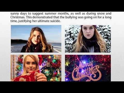


