
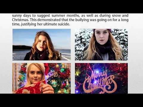
I am very pleased with my poster after making improvements as I feel that it looks much more professional. For example, I reduced the opacity of the images to 80% because they looked too bright on the page previously. This works well as they blend into the background slightly. Moreover, they look slightly ghostly which foreshadows my main character committing suicide.
Additionally, I stretched the red banner across the entire width of the page which makes the images look less cut off. This also links to the top banner. Many student-made posters fail to convey that the product is a short film therefore I wanted to draw attention to this.
 I think that my popping colour works brilliantly as it connotes the danger conventional of the drama genre whilst suggesting the battle between good and evil-binary opposites. I used this in my title, top banner, actors' lipstick and 'Coming Soon' in order to make these stand out.
I also included the names of the actors as this is conventional of film posters. However, I placed them in the top banner above their image as this is where the names are typically found. I did not add a drop shadow to this text so that it did not blend in with "a short film by Lauren Heslop". I purposely did not capitalise 'a' because I wanted the capitalisation to come only in the name, which is more important.
Furthermore, I changed my tagline to clearly address my plot more as I agree that my previous tagline "sticks and stones" was too vague. Also, I think that this tagline sounds more exciting and appealing to audiences. It is now "Escape the bully." This could also link to the concept that the bully is also escaping from something.
 I also feel like I successfully took inspiration from my researched concepts. For example, I used half faces in my poster in order to portray that my characters are hiding something by concealing themselves. Equally, I used red as my statement colour due to its connotations with bullying and danger.
Overall I am very pleased with my finished poster because:
- it has connotations with my drama genre and will consequently attract the right audience
- I have successfully used the conventions of a professional film poster
- the images were edited well using Photoshop by reducing the opacity and adding make up
- the placement of the images has connotations with hiding from something
- my house style is consistent throughout my film, poster and double page spread in terms of colour and font


No comments:
Post a Comment