I began by cutting out any unnecessary shots which had no impact on my plot. This meant that my film was shorter, and consequently was more engaging for audiences.
One piece of feedback I received was that I could include some faster shots. Although I did not particularly agree with this due to the slow pace suiting my melancholic music and sad atmosphere, I did edit one shot to be faster. My protagonist is seen sat on the floor in front of the lockers and people ignore and walk past her without helping. This shot lasted 12 seconds previously therefore I increased the speed of this to 300%...

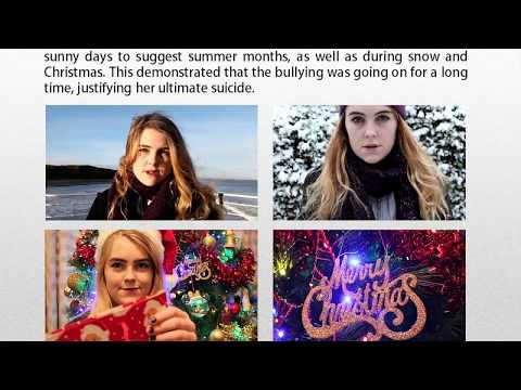
I liked the result because it looked similar to a time lapse and implied that more people also ignored the bullying.

I also improved the appearance of my title; this was only placed to represent how it would look. I decided to use the same font which I used on both my poster and double page spread in order to link to my house style. Due to this, I had to choose a font available on Premiere Pro, Photoshop and InDesign therefore I was slightly limited. This is the font I chose...

Whilst simple, I am pleased with this because it suits the educational theme of my piece whilst being bold. Furthermore, on my poster I will put it onto a red block to make it stand out even more and emphasise my popping colour. I added a subtle drop shadow to make it look more interesting and stand out. Although it will be white on my poster, it was important to me that I use the same font in order to link to my house style throughout my main product and ancillary tasks.
I also added my statistic about bullying at the end in order to reflect the educational theme of my product. The statistic I decided to us was...

This was from http://www.bullyingstatistics.org/content/bullying-and-suicide.html. I wanted to include a shocking statistic that was true and sad to make my audiences reflect more on what they had just watched. I also aimed to use a fact that included bullying AND suicide as these were both themes of my product. I placed this on a black background and used white text so that it stood out. I also used the same font as my title and the one used in my poster and double page spread to represent my house style.

I used simple colours and font so as not to detract from the severity of the statistic. I also thought that it was best to place this at the end of my film because it triggers a lingering thought in my audiences so that they are more reflective.


No comments:
Post a Comment